02. Frequency Distributions & Data Visualization

Examples: Data Visualization

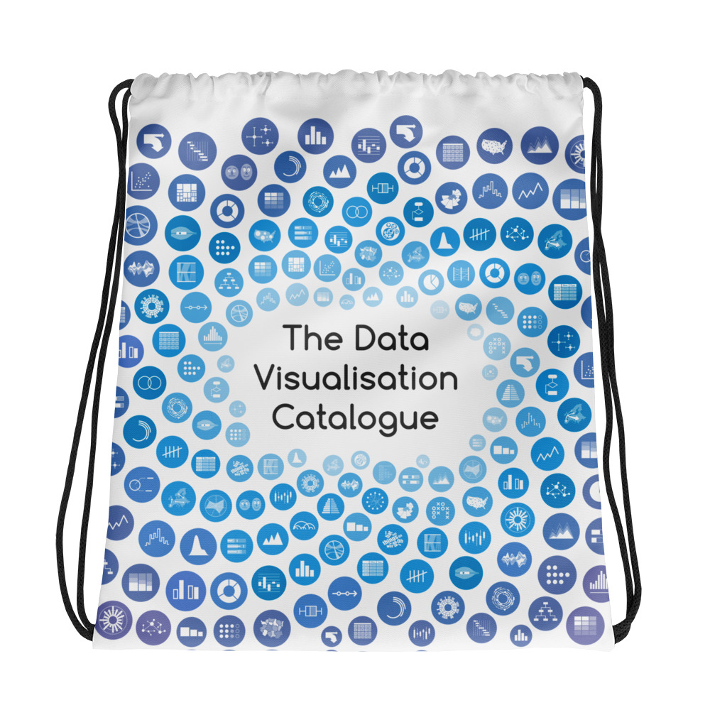
The Data Visualization Catalogue is a project developed by Severino Ribecca to create a library of different information visualization types. This site features most every type of data visualization you an imagine (including some of the most common in psychology– bar chart). Each contains a description, examples, tools for creation, and a video. You can access the site […]

Examples: Data Visualization Read More »

Three Things You Can do to Make Your Data Tables More Visual

Tables that contain a lot of data can be difficult to understand. This article from PolicyViz.com shows a few ways to make that information more manageable by simplifying information, highlighting key pieces, and using the right type of chart. You can find the full article here.

Three Things You Can do to Make Your Data Tables More Visual Read More »

Resources: Stats of Doom

A comprehensive site created by Dr. Erin Buchanan offering lecture materials and videos for a full range of statistics concepts covered in a basic/introductory course (descriptives, graphs, z-scores, t-tests, ANOVA, correlation, regression, chi-square, etc.). Coverage also includes materials for several statistics packages (e.g., SPSS, JASP, R) Here is a link for a basic course. There

Resources: Stats of Doom Read More »

Student Guide to SPSS and APA Style Writing (v.12.0)

This guide (created by Gary Lewandowski; Twitter: @LewandowskiPhD) is a free resource that can substitute for the APA Manual and SPSS guides. The Student Guide leads students through data analysis in SPSS with step-by-step instructions and screenshots for setting up the analyses and interpreting the output. For each analysis, students also see an example SPSS

Student Guide to SPSS and APA Style Writing (v.12.0) Read More »

Video: Frequencies and Descriptive Statistics (SPSS for Beginners)

Video (14:01) from Research by Design and Dr. Todd Daniel, described as follows, “Having learned how to create a variable, you are ready to begin entering data. Dr. Daniel begins with descriptive statistics (numbers that describe our data) and shows you how to do some basic data cleaning and data exploration with the Frequencies command

Video: Frequencies and Descriptive Statistics (SPSS for Beginners) Read More »

Video: Computing Frequencies and Creating an APA-Style Frequency Table Using JASP, Excel, and Word

Concise video from Research by Design in which, “We create an APA-style frequency table with scores in descending order, simple frequency, relative frequency, cumulative frequency, percentile, and sample size. We use JASP for the statistics, Excel for the formatting, and wrap it all up for presentation in Word. These same techniques work with open-source word

Video: Computing Frequencies and Creating an APA-Style Frequency Table Using JASP, Excel, and Word Read More »

Assignment: Data Visualization (Histograms, Pie Charts, and Scatterplots) (SPSS)

In this assignment (created by Dr. Kimberly A. Barchard and Dr. Leiszle Lapping-Carr), students learn how to create and edit histograms, pie charts, and scatterplots in SPSS. A detailed grading rubric is included. This assignment was designed to be completed with an existing dataset (the address is given on the assignment). The handout includes instructions

Assignment: Data Visualization (Histograms, Pie Charts, and Scatterplots) (SPSS) Read More »

Link: Spurious Correlation Examples

A website dedicated to creating charts depicting ridiculous correlations (like the one in the picture–clearly we must stop putting Nicolas Cage in films!). You can also pick two variables of your own from a list including topics like: interesting causes of death, sunlight by state, marriage and divorce rates. A great way for students to

Link: Spurious Correlation Examples Read More »

Design & Data: How Do Parents Respond to Their Child’s Public Tantrums? (Observational Research/Descriptive Statistics)

Key Topics and Links to Files Data Analysis Guide The Many Forms of Discipline in Parents’ Bag of Tricks Analyses Included: Descriptive Statistics (Frequencies; Central Tendency); Inter-observer Reliability (Cohen’s Kappa); Inter-observer Reliability (Pearson’s r); Creating a Mean; Creating a Median Split; Selecting Cases Dataset Syntax Output BONUS: Dyads at Diners (How often and how much

Design & Data: How Do Parents Respond to Their Child’s Public Tantrums? (Observational Research/Descriptive Statistics) Read More »

Assignment: Creating a Conference Poster on Sex Differences (SPSS)

In this assignment (created by Dr. Kimberly A. Barchard and Dr. Leiszle Lapping-Carr), students conduct a literature review, analyze data using an independent samples t-test and a confidence interval, create a grouped frequency distribution and a histogram, write a research report, and create a PowerPoint poster. A detailed grading rubric is included. This assignment was

Assignment: Creating a Conference Poster on Sex Differences (SPSS) Read More »

Activity: Orange You Glad for Descriptive Statistics?

This is a lab or classroom activity “Oranges Are the New Statistics“(created by Kathrine Frey Frøslie) that has students peel oranges and collect data from various aspects of the experience (e.g., number of wedges, speed of peeling, weight of oranges, etc.) Students then use this data to calculate descriptive statistics such as central tendency, and

Activity: Orange You Glad for Descriptive Statistics? Read More »

Link: FiveThirtyEight.com’s Hack Your Way to Scientific Glory

This website lets you take the wheel and play with several different parameters during data analysis. By defining who you’re sample is, how you measure economic performance, an what other variables you factor in, you’ll get to see how it impacts results. Sure enough, after a few tries you’re virtually sure to get “publishable” findings.

Link: FiveThirtyEight.com’s Hack Your Way to Scientific Glory Read More »